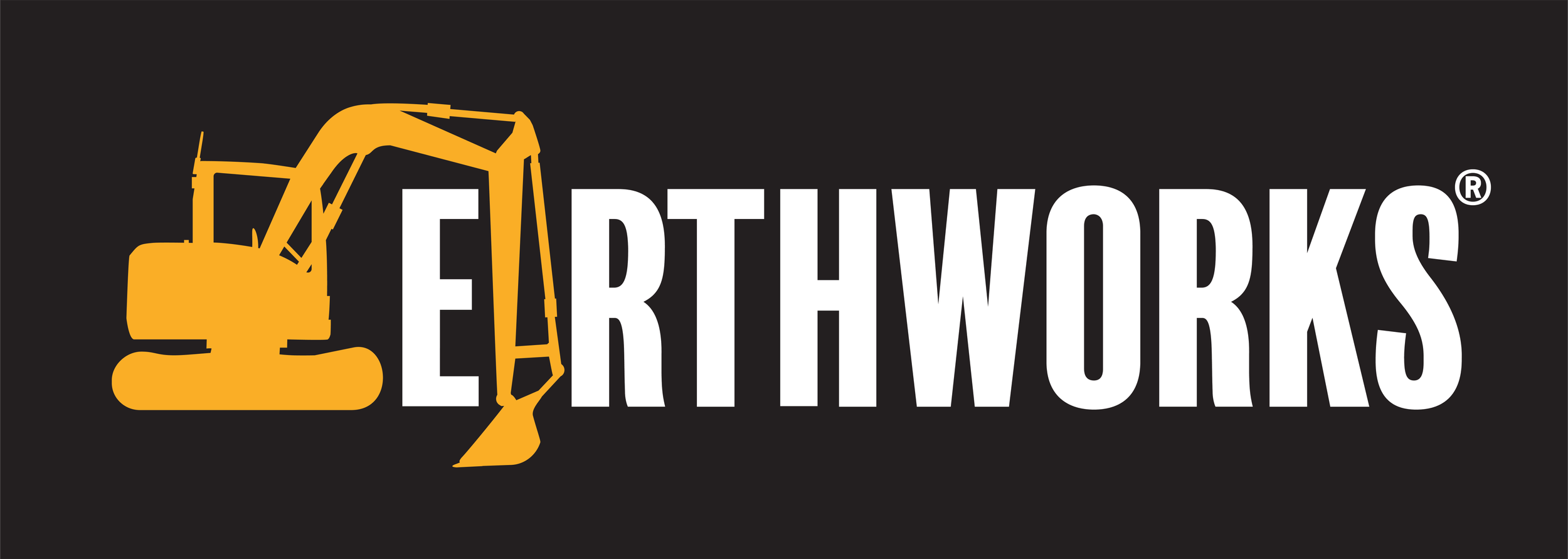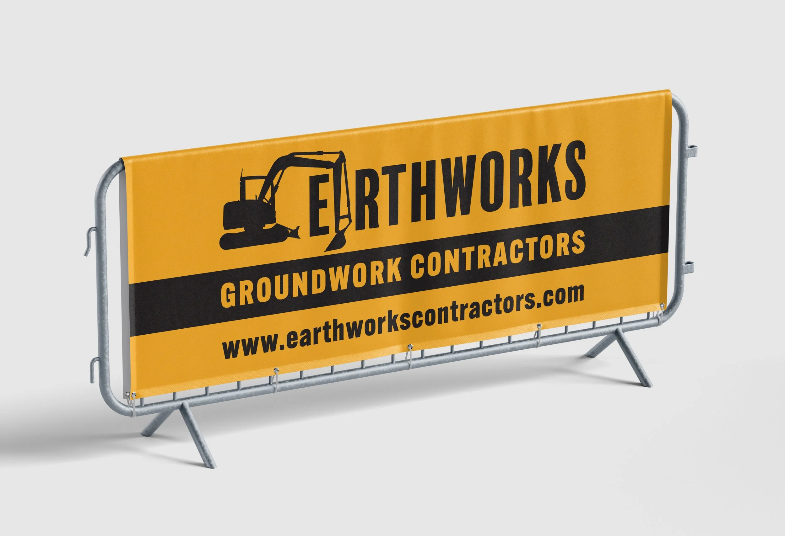
Brief: A groundwork contracting company required a strong, reliable identity that reflected construction, expertise and trustworthiness.
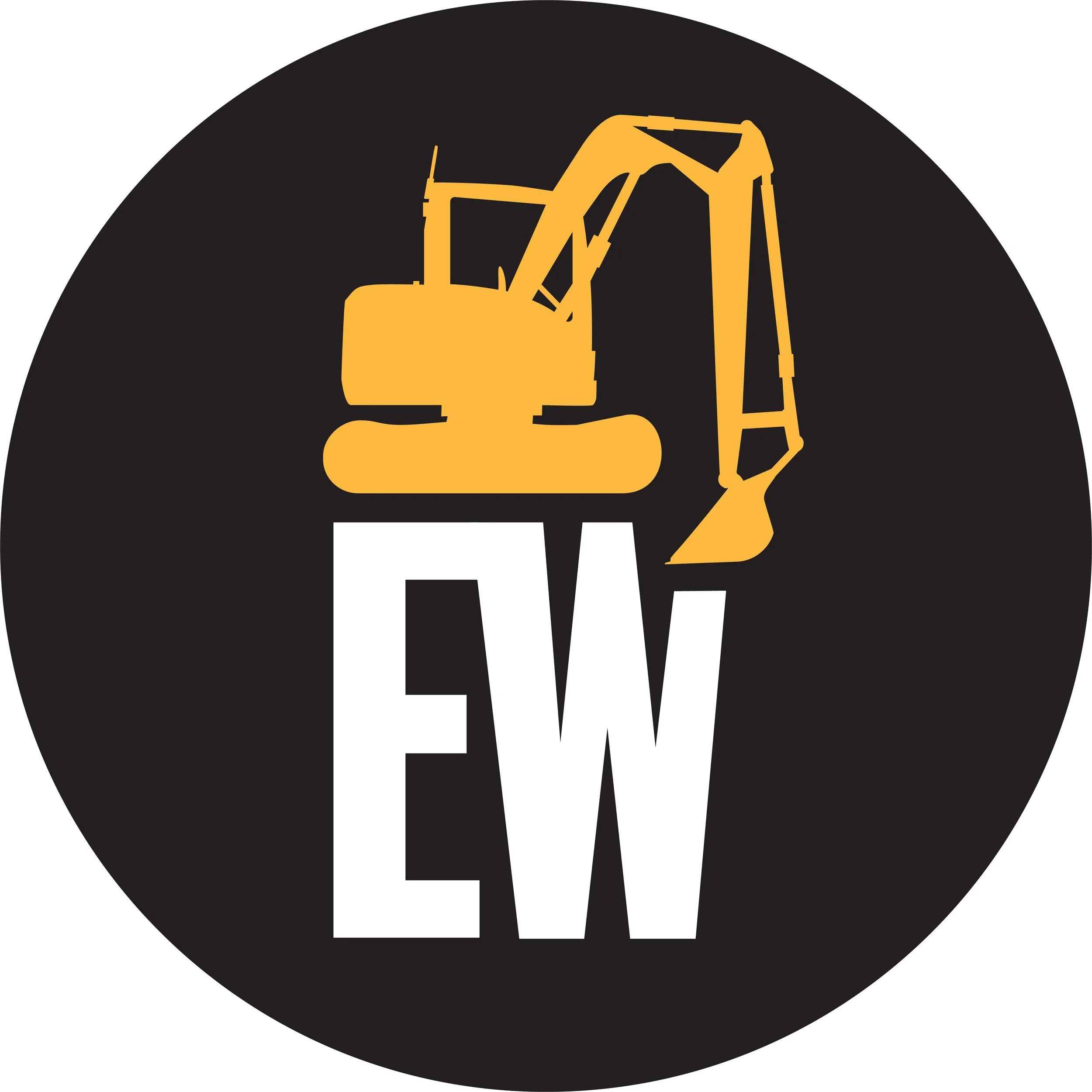
Solution: The logo uses solid block lettering to represent durability, with the digger arm forming the letter ‘A’ to visually communicate the company’s service at a glance. The black, white, and orange colour scheme draws inspiration from JCB’s trusted industrial branding, giving it a professional and familiar feel.