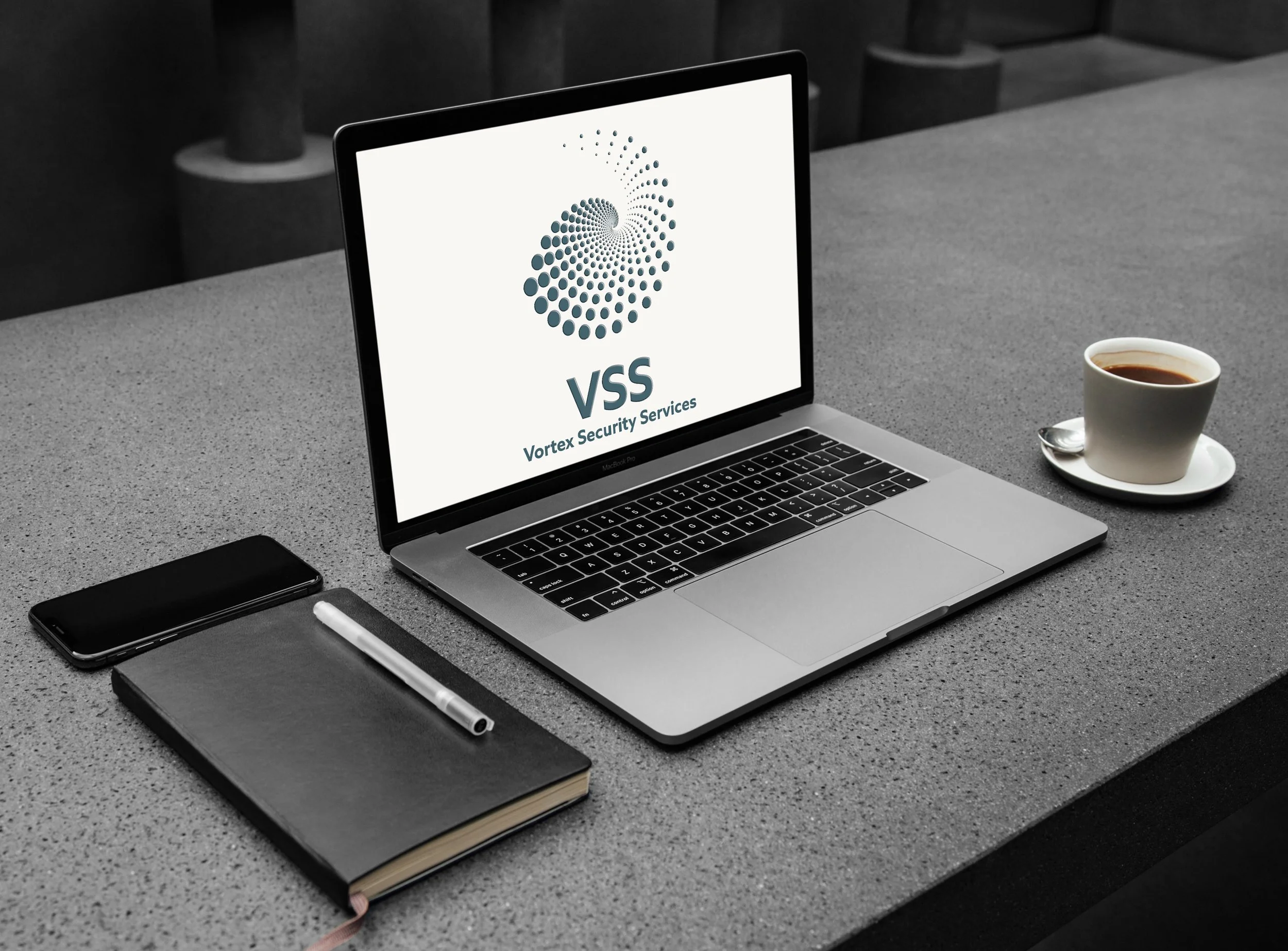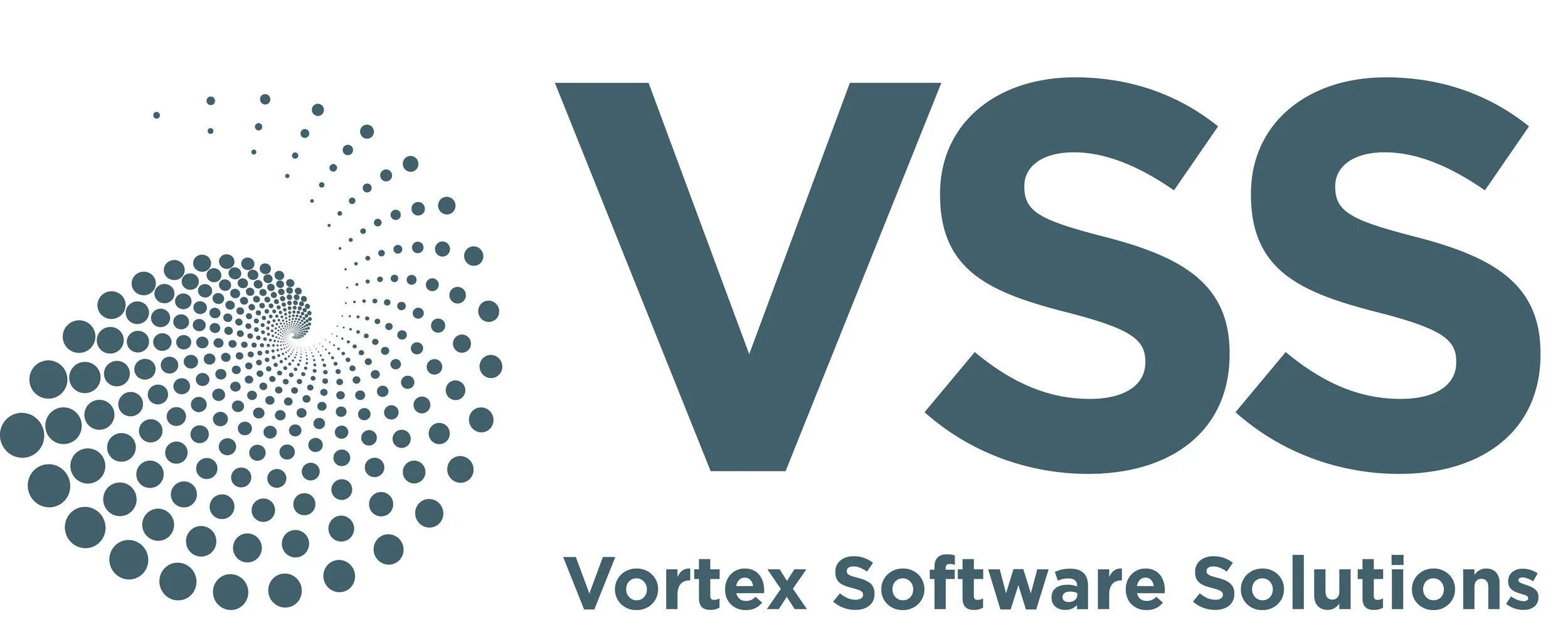
Brief: A security services firm comissioned a new logo design to be branded across multiple applications. It needed to express reliability, structure, and authority. The goal was to provide a professional image that would inspire trust in clients.
Solution: A vortex, spiral symbol was paired with a bold, block letter monogram. The layout uses symmetry and consistent spacing.
The restrained colour choice adds to a sense of stability and reliability.