Portfolio
AIR Developments
Brief: A property development company required a sharp, modern identity that conveyed trust, stability, and forward-thinking values.
Solution: The design uses strong geometric typography and a minimal complimenting palette, reflecting architectural precision while keeping the brand approachable for clients and investors.


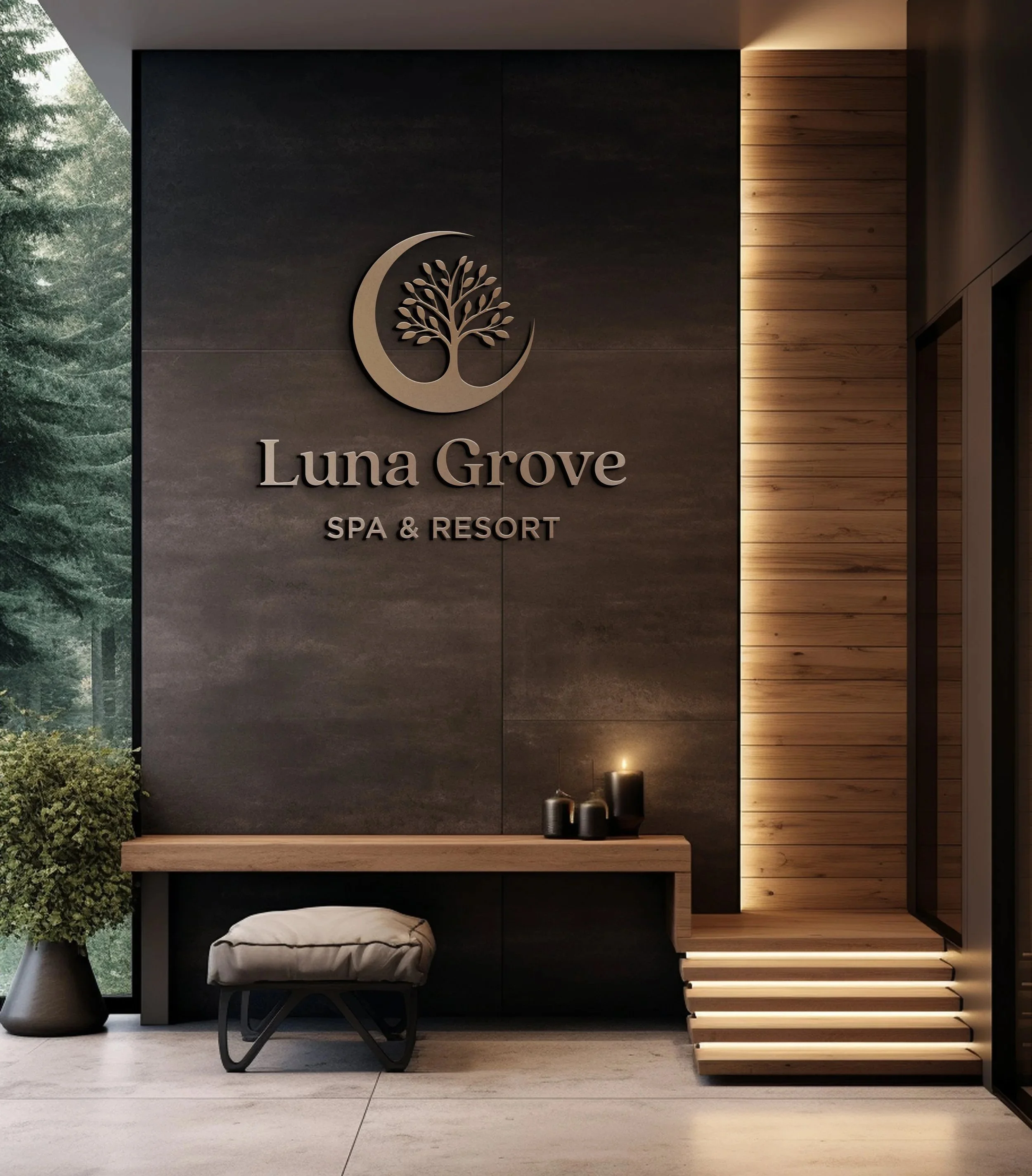
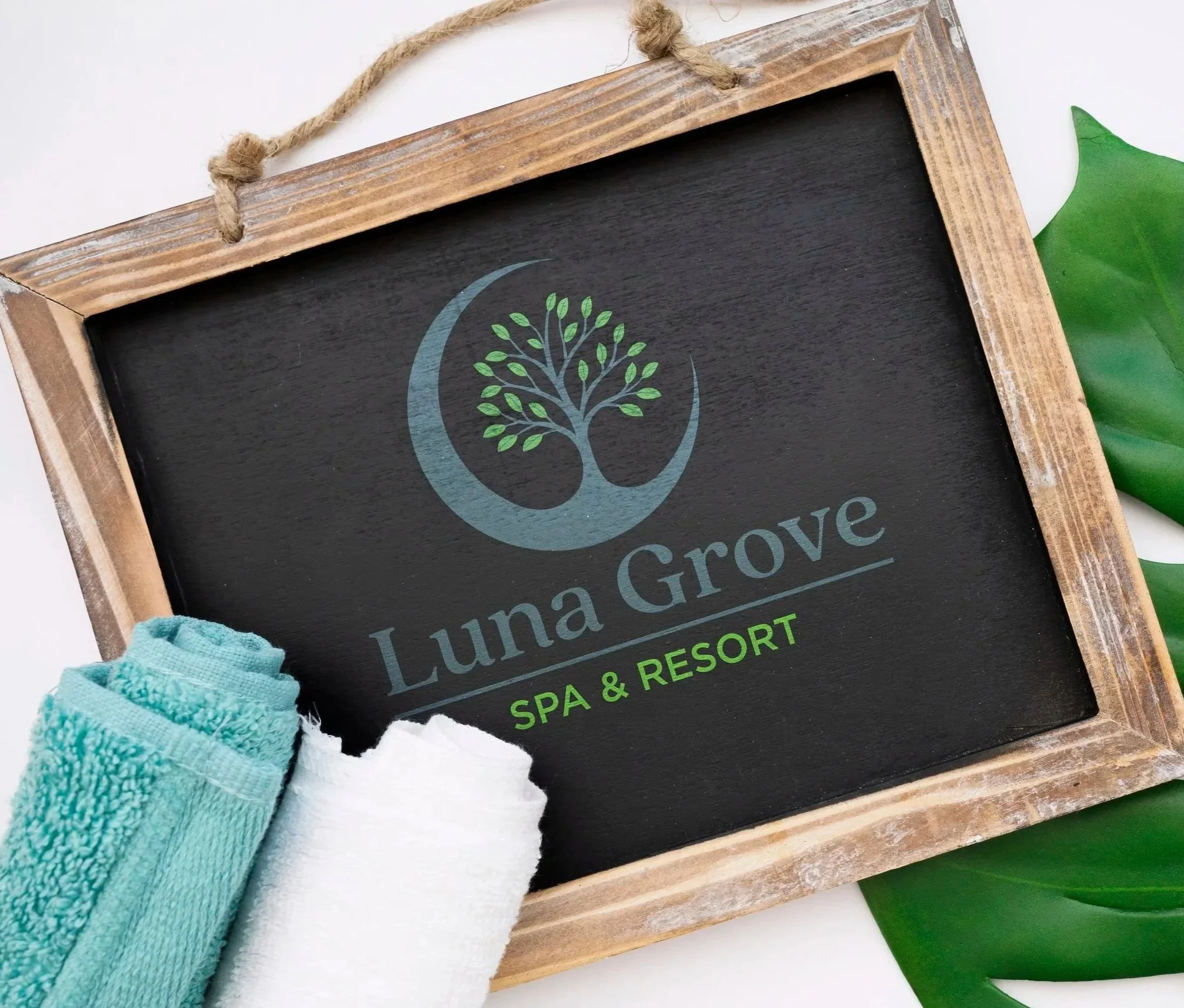
Luna Grove
Brief: A spa resort, required branding that conveyed relaxation, balance, and natural harmony. The client wanted an identity that would feel both modern and tranquil, appealing to those seeking an escape from everyday stress.
Solution: Soft curves, organic shapes, and a calming palette were chosen to reflect growth and renewal. The typography is clean yet gentle, echoing serenity, while the overall identity creates a peaceful, restorative atmosphere.


VSS
Brief: A corporate services firm needed a professional identity that highlighted structure, reliability, and authority in its field.
Solution: Bold lettering and a symmetrical logo system were developed, projecting confidence while maintaining a simple, trustworthy visual style.


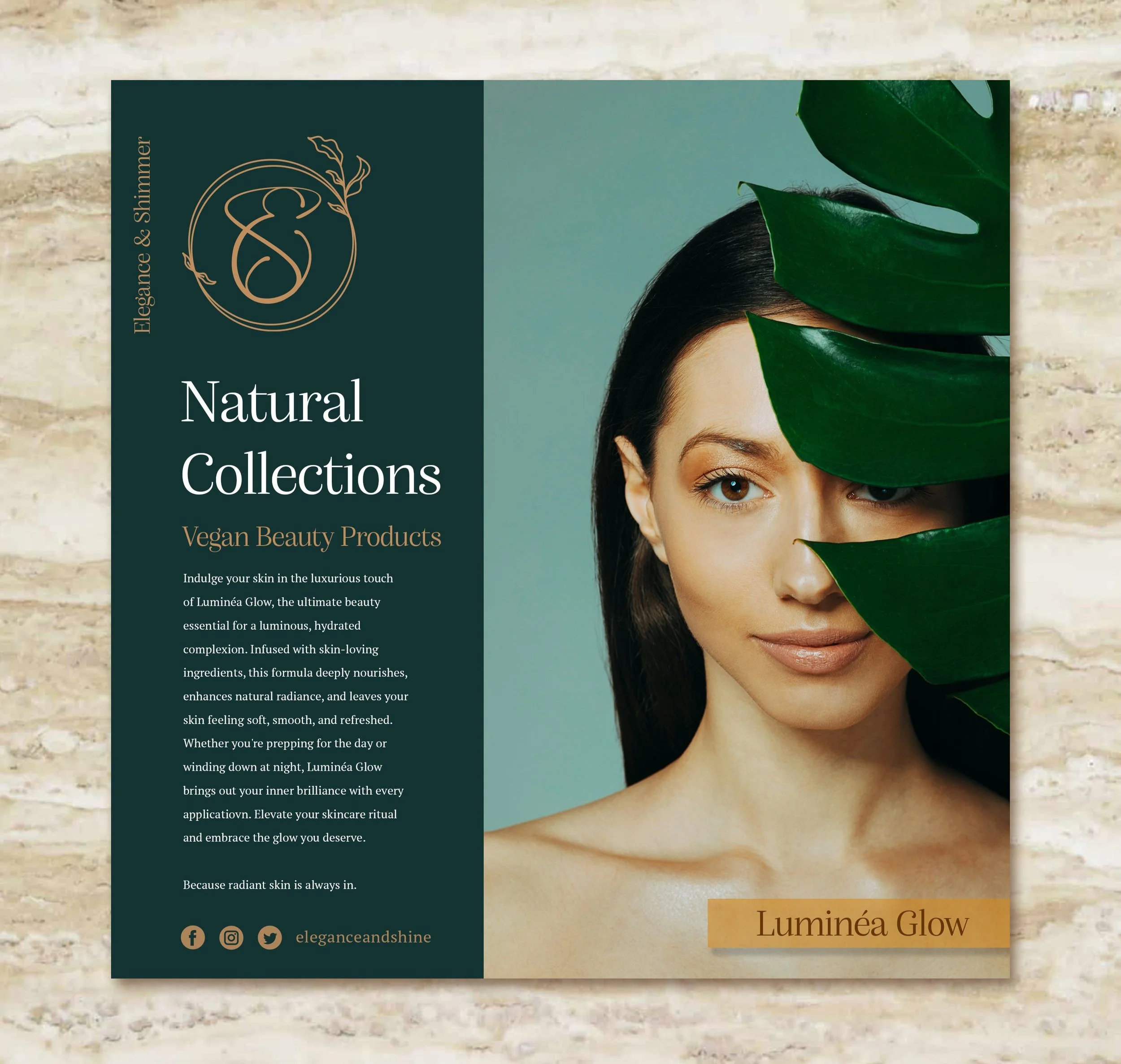
Elegance & Shimmer
Brief: A luxury beauty product range desired an identity that captured sophistication and timeless beauty without excessive decoration.
Solution: The design uses clean typography and a hint of shimmer to feel elegant yet understated.


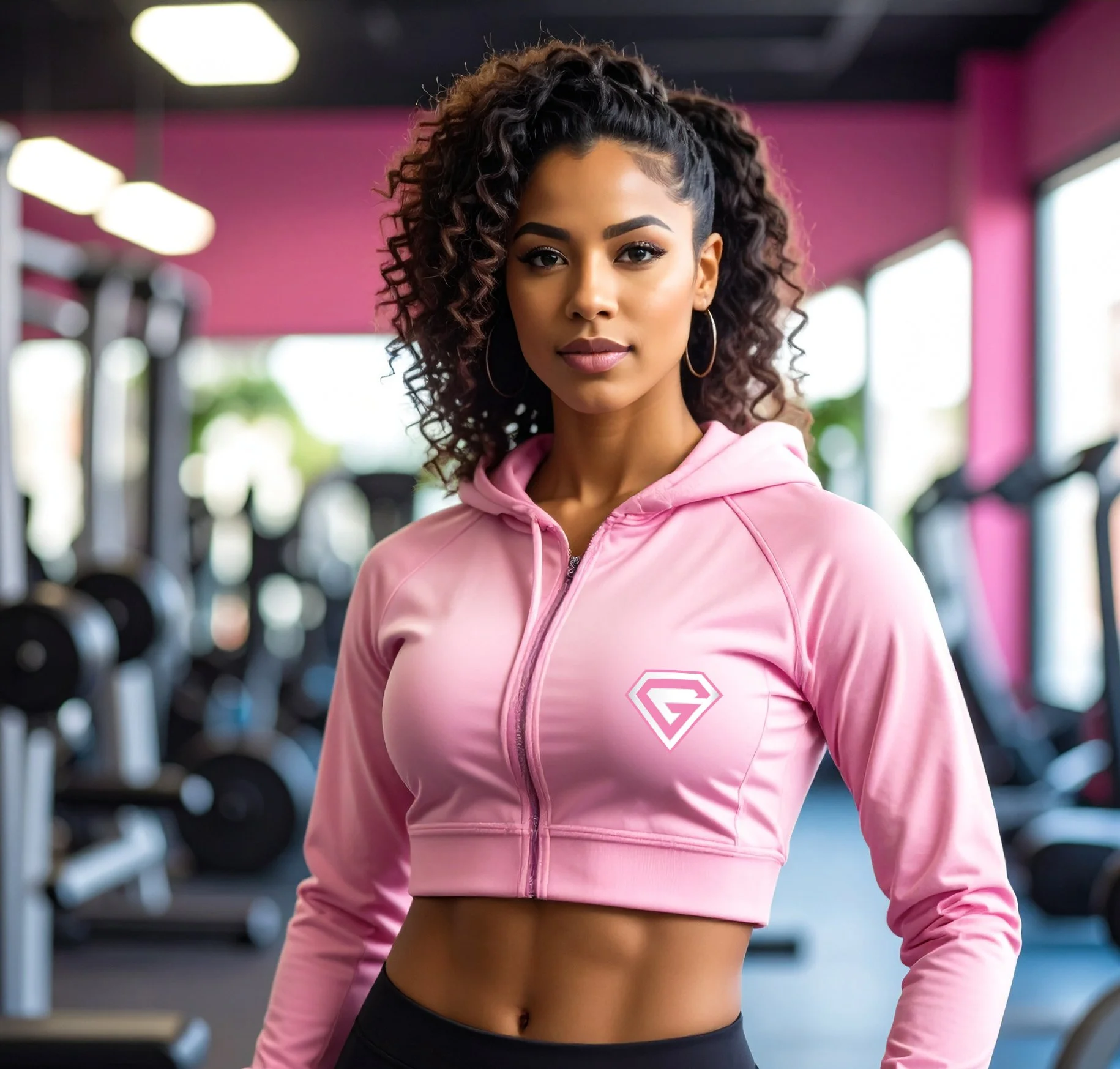
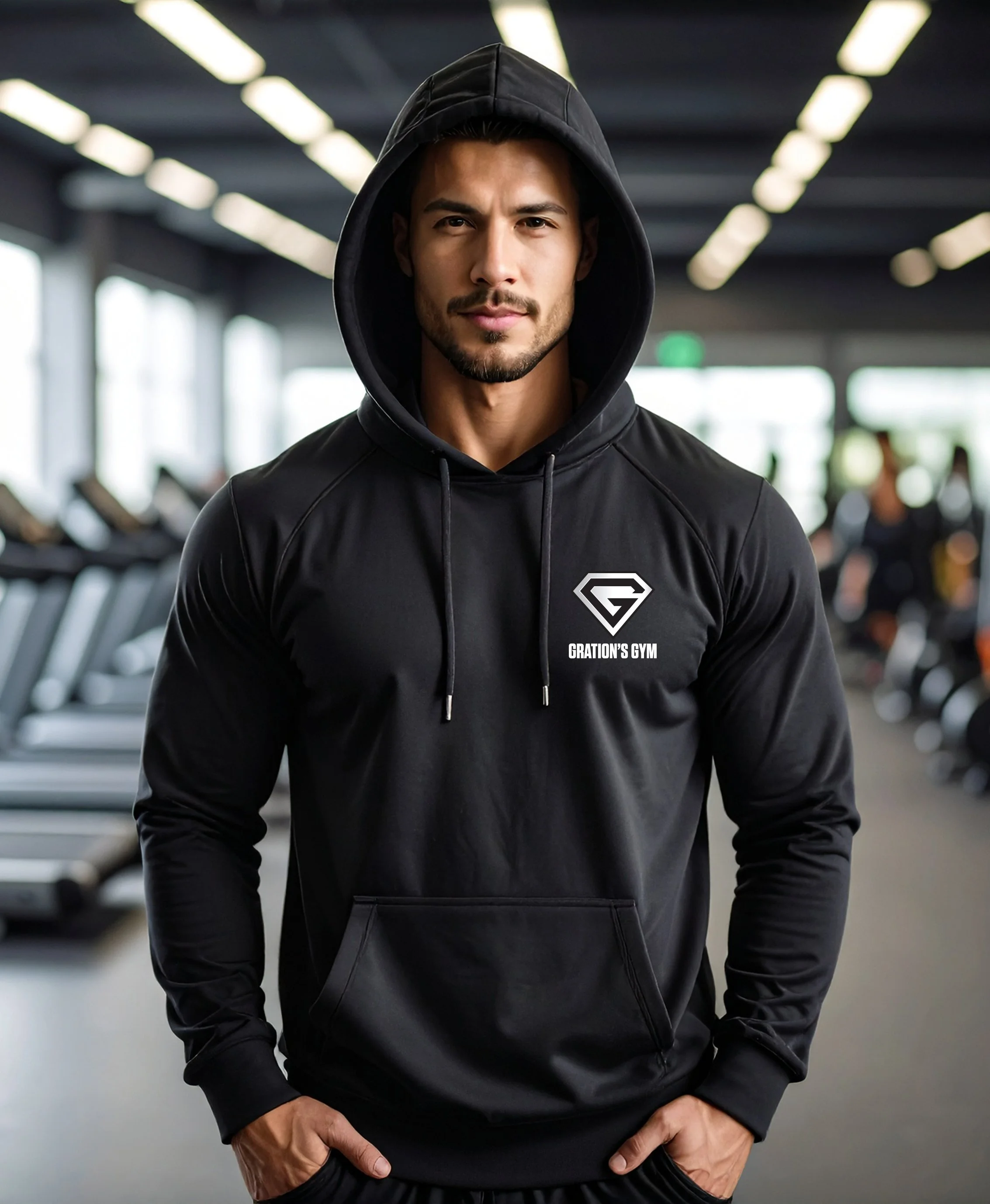
Grations Gym
Brief: A local gym required branding that would energise members, appeal to fitness enthusiasts, and stand out in a competitive market.
Solution: Dynamic typography and bold, similar look as ‘Superman’ logo, heavy shapes give the logo strength and impact, while vibrant contrast communicates energy and motivation.


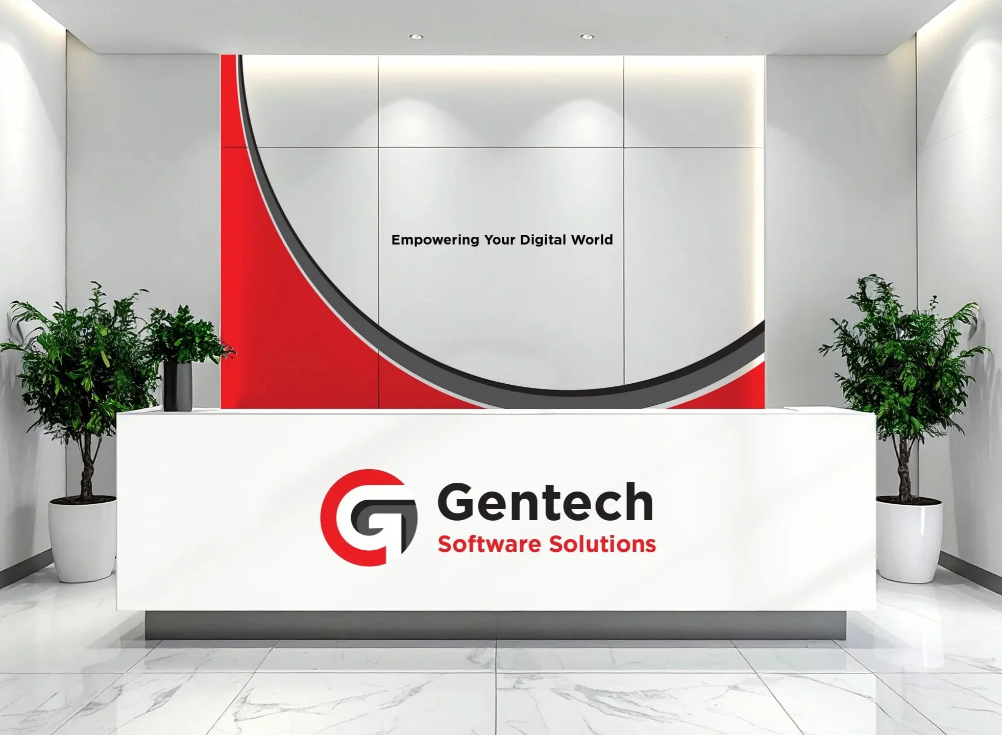
Gentech Software Solutions
Brief: A technology company required a brand identity that reflected innovation, reliability, and forward-thinking solutions. The client wanted a design that would appeal to both corporate clients and modern startups, communicating technical expertise without feeling cold or inaccessible.
Solution: A clean, geometric logo system was developed with sharp lines and modern typography to suggest precision and innovation. A cool, professional palette reinforces trust and stability, while subtle dynamic elements hint at adaptability — positioning the brand as both cutting-edge and dependable.


Black Oak Coffee
Brief: A speciality coffee brand required an identity that felt bold, premium, and memorable. The client wanted to stand out in a competitive market by combining a sense of artisanal craft with a modern, high-end feel.
Solution: A deep monochrome palette was paired with strong, elegant typography to echo the richness of roasted coffee. The restrained design creates a commanding presence, while subtle detailing reflects the brand’s focus on quality and sophistication.


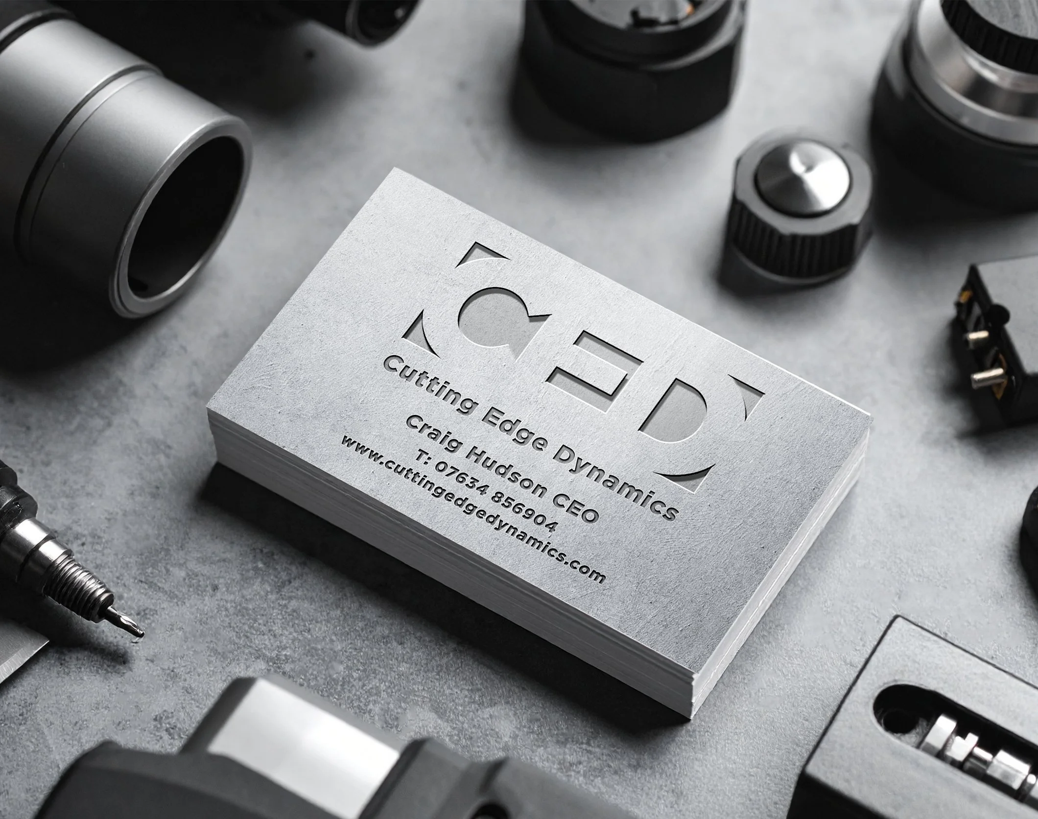
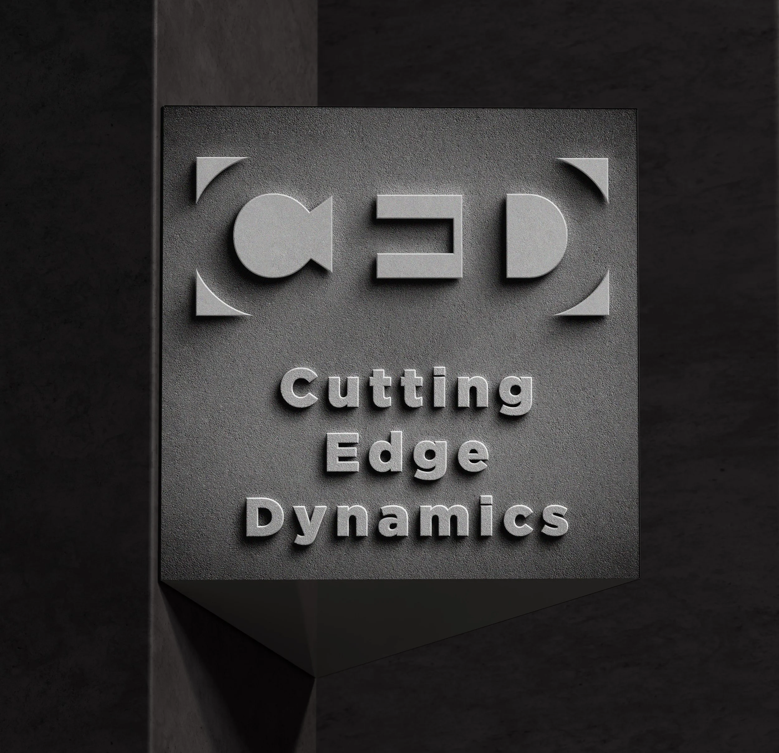
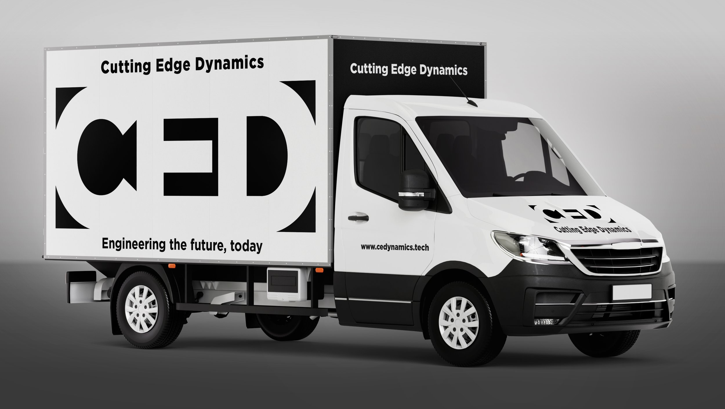
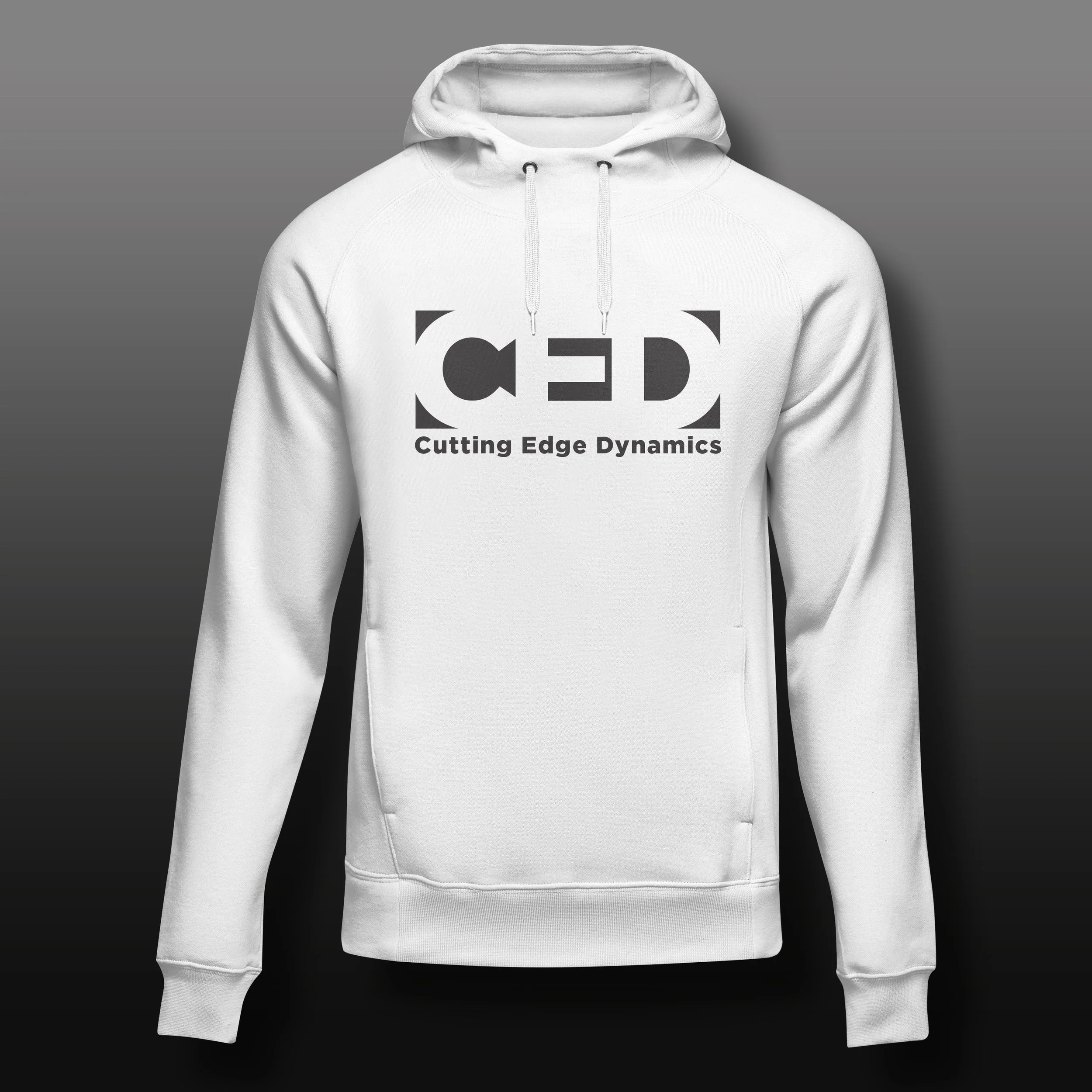
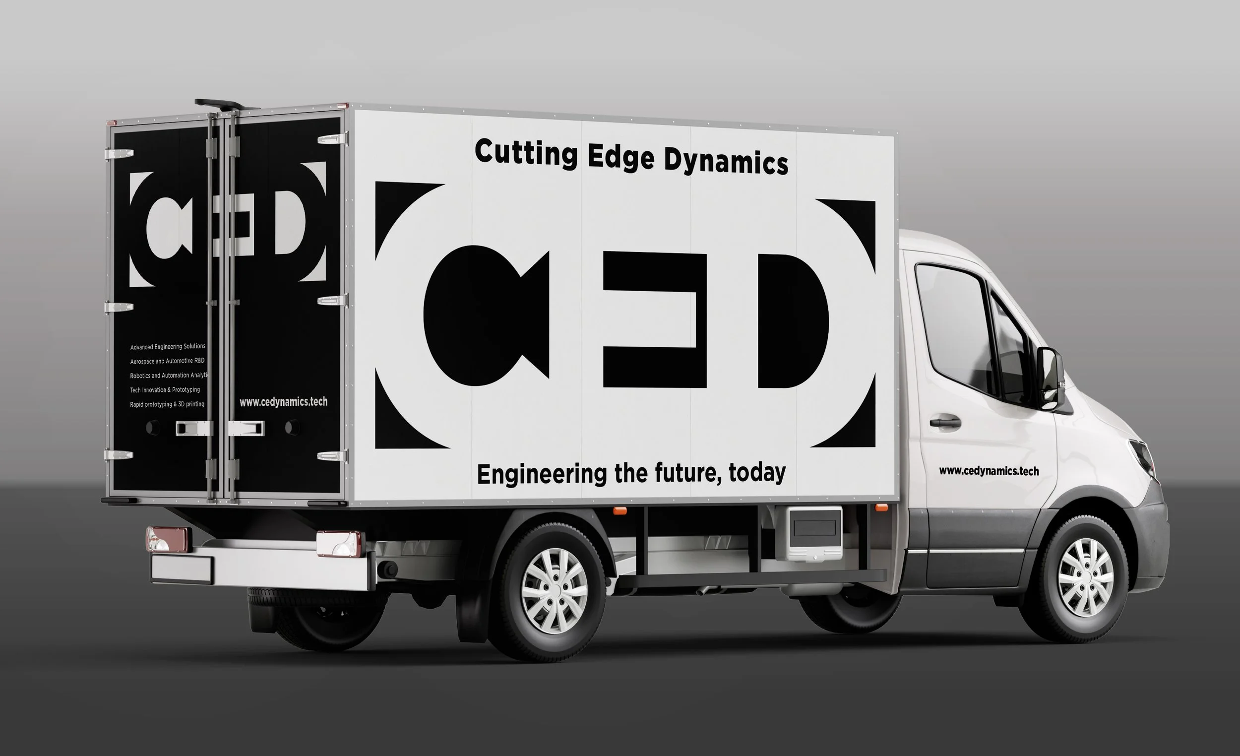
CED - Cutting Edge Dynamics
Brief: An engineering firm wanted a modern, minimalist identity that expressed technical expertise while remaining approachable to clients.
Solution: Clean, structured lines and a balanced colour scheme were used to mirror precision engineering.
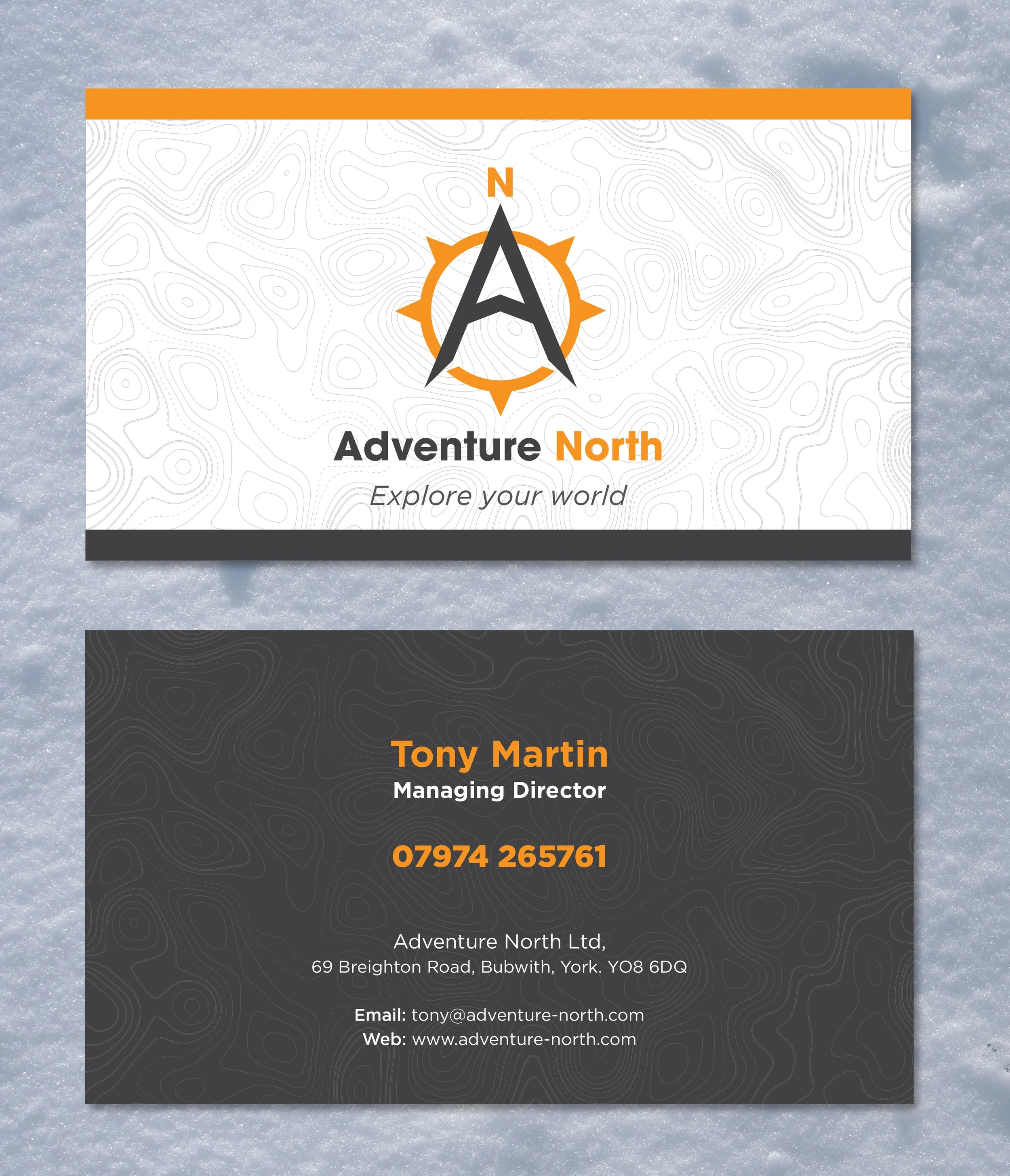
Adventure North
Brief: An outdoor adventure company wanted a brand identity that captured the spirit of exploration and discovery. The client asked for a design that would resonate with hikers, campers, and explorers, while reflecting rugged landscapes and a sense of freedom.
Solution: A bold typographic mark was created with angular forms and subtle texture to echo natural terrain. The design balances strength with simplicity, making it versatile across signage, apparel, and digital platforms, while the outdoor-inspired detailing reinforces the brand’s adventurous character.


Bella Piatto
Brief: An Italian pasta maker needed a visual identity that was warm, authentic, and visually representive of Tuscany Italy.
Solution: Rounded typography and traditional design cues were paired with contemporary styling, bridging rustic charm with modern presentation.


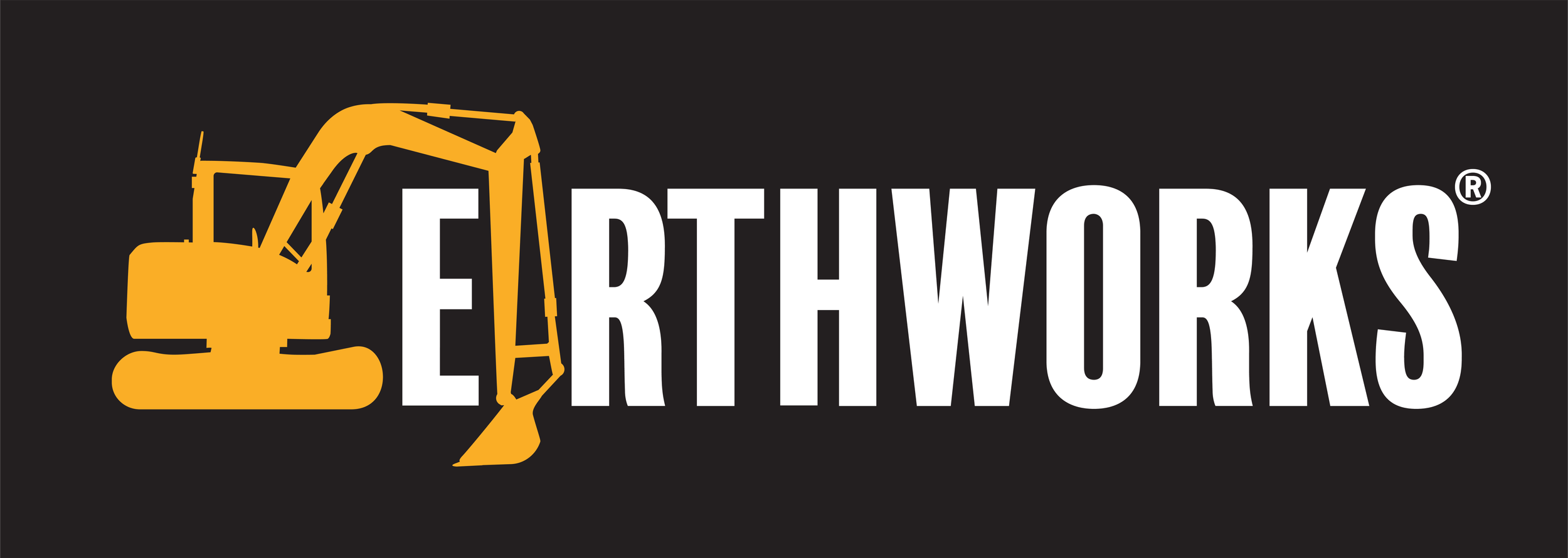
Earthworks
Brief: A groundwork and contracting company required a strong, reliable identity that reflected construction expertise and trustworthiness.
Solution: Bold block typography and industrial tones were combined to mirror strength and durability, while keeping the look modern and professional.


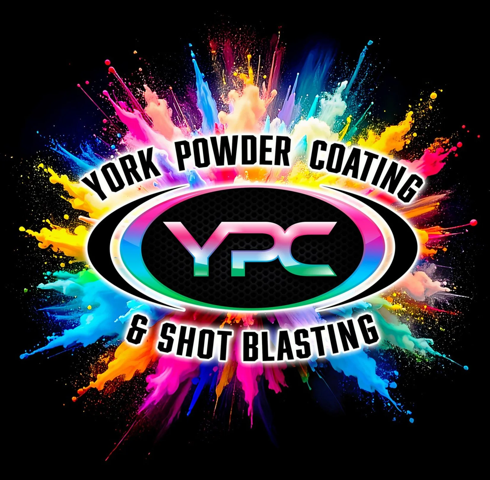
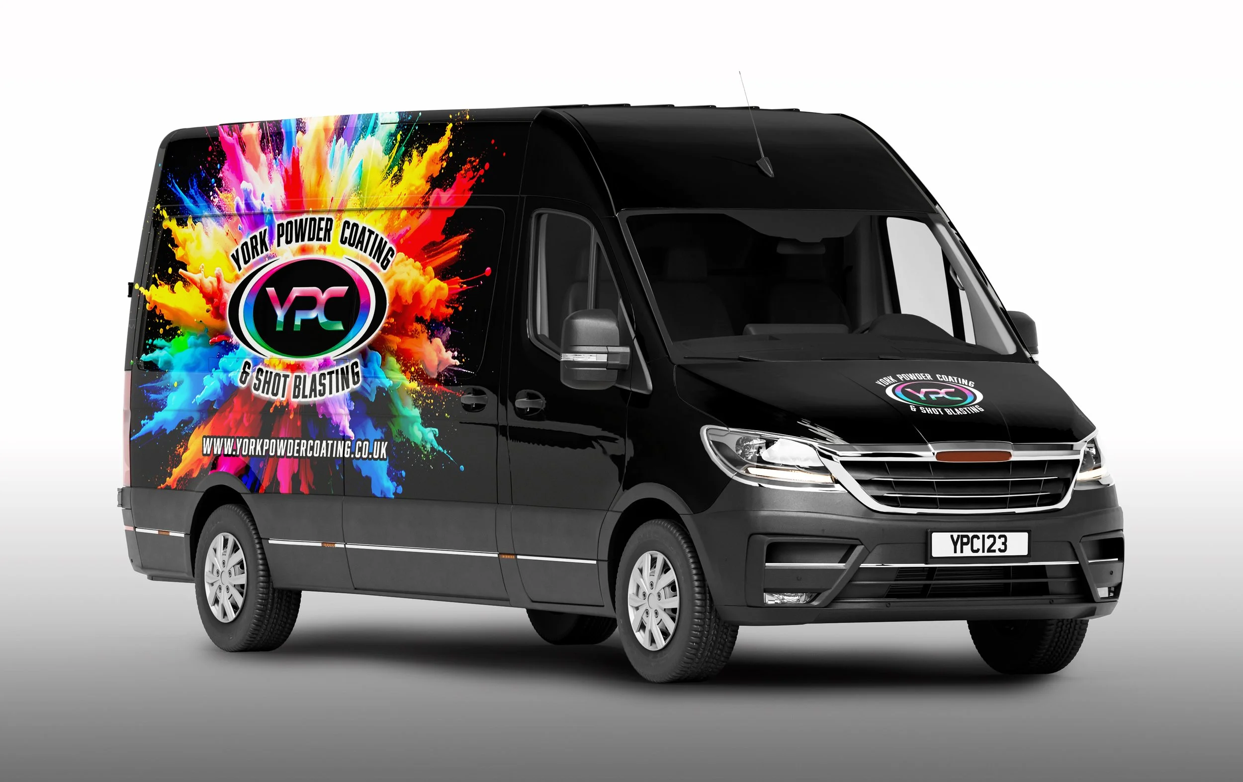
YPC - York Powder Coating
Brief: A powder coating company wanted a brand identity that was bold, modern, and instantly recognisable. The client asked for bright visuals that would set them apart in an industrial sector often dominated by muted tones.
Solution: A vibrant colour palette and sharp geometric forms were developed to reflect durability and precision while maintaining strong visual energy. The design balances industrial strength with a striking, contemporary look that ensures the brand stands out across applications.
Acorn Rare Breeds
Brief: A rare breed farm and butcher needed a brand identity that celebrated tradition, quality, and natural farming practices. The client wanted the branding to reflect the heritage of pasture-fed livestock while feeling approachable and trustworthy to customers.
Solution: A friendly yet robust logo was developed, combining organic forms with clear typography to echo both nature and craft. The design highlights authenticity and respect for farming traditions, while maintaining a professional look suited for packaging, signage, and retail environments.


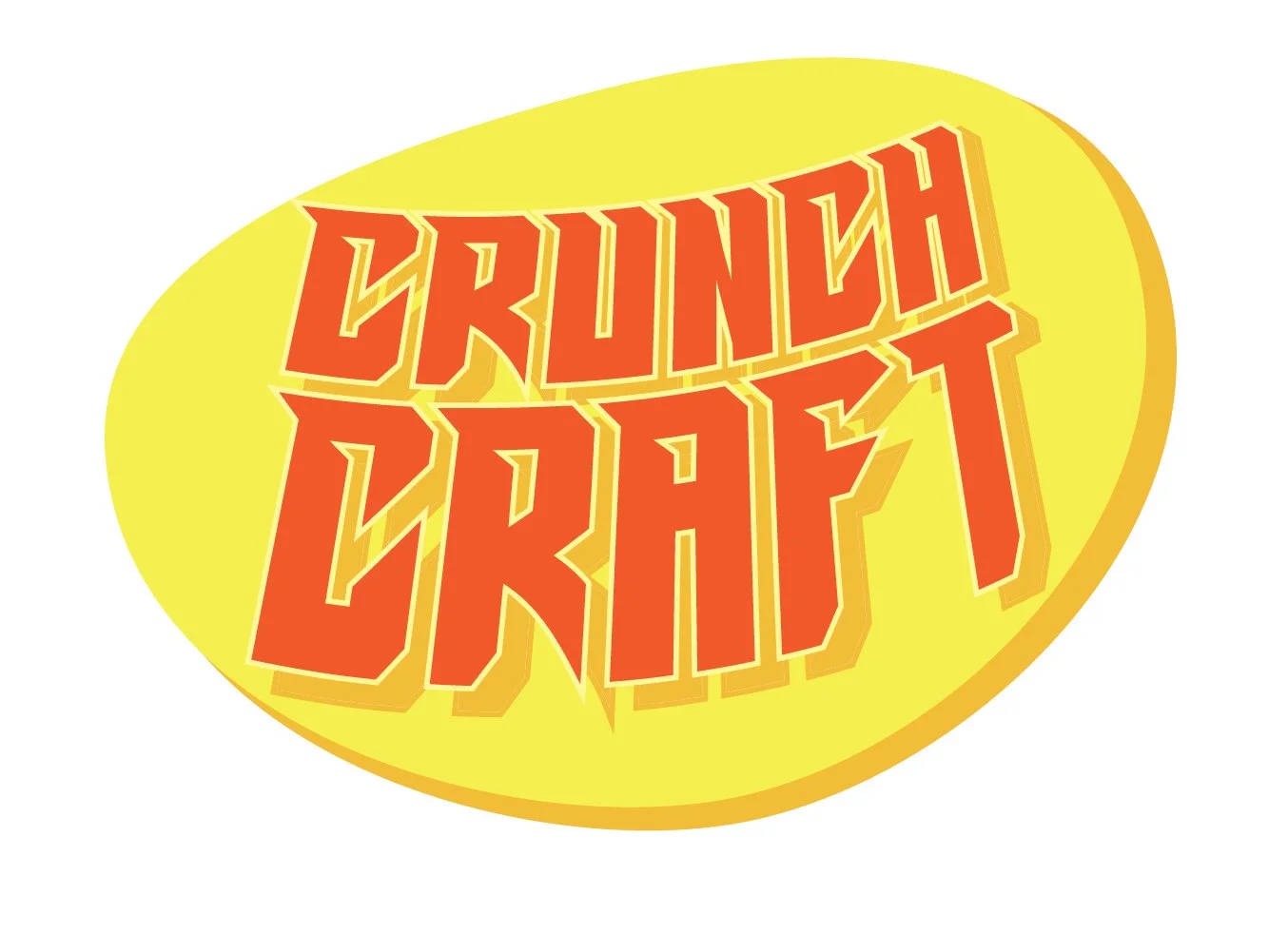
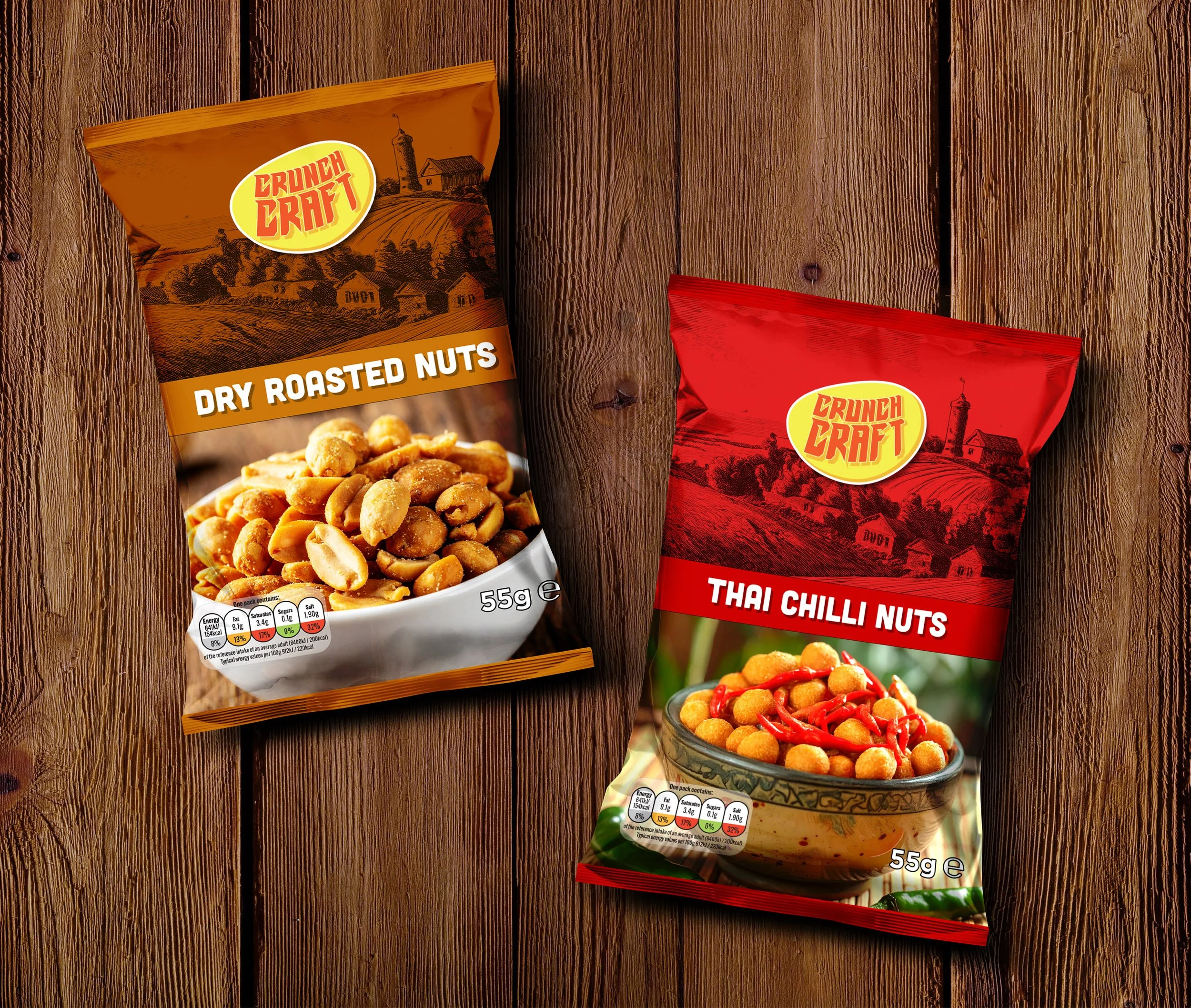
Crunch Craft Crisps
Brief: A snack company wanted a new logo and packaging that jumped off the shelf and appealed to a younger, trend-driven audience.
Solution: Bright colours, bold typography, and playful graphic elements were used to give the identity maximum impact in retail settings.

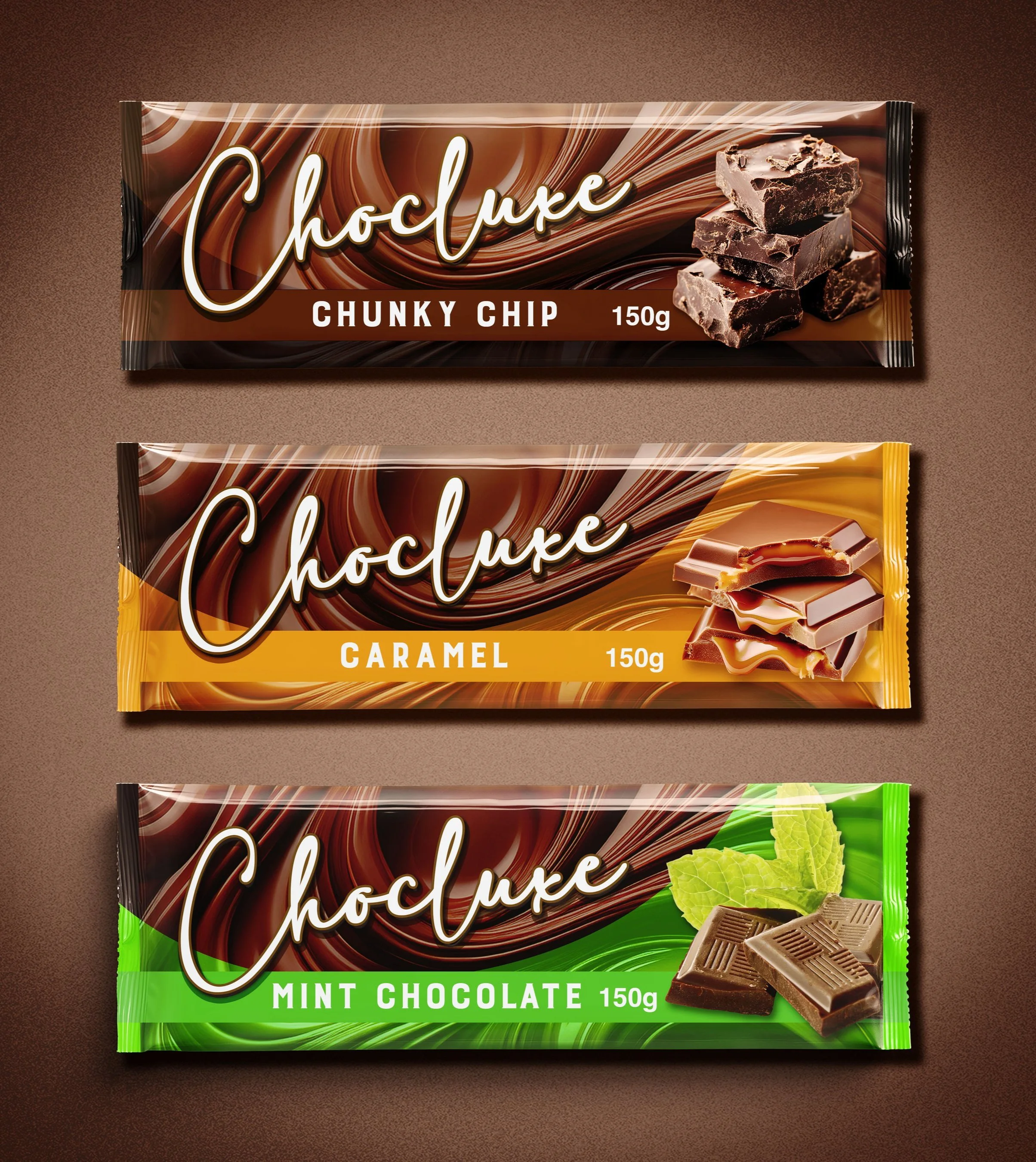
Choculuxe
Brief: A premium confectionery brand wanted a luxurious identity that captured indulgence and elegance. The client asked for a design that would communicate richness and sophistication, appealing to an audience who value quality and exclusivity in their treats.
Solution: A refined identity was developed using deep, decadent colour tones and elegant typography to echo the richness of fine chocolate. Subtle detailing adds a sense of craftsmanship, while the overall design balances indulgence with modern simplicity, positioning the brand as both desirable and memorable.